
“`html
Color Palette Trends: What’s Hot in 2024, Predicting 2025, and the Future of Color in Design
Estimated reading time: 15 minutes
Key Takeaways:
- Earthy Neutrals offer a calming and nature-connected feel.
- Jewel Tones provide luxury and draw attention.
- Muted Pastels present a modern and gentle aesthetic.
Table of Contents
- Color Palette Trends: What’s Hot in 2024, Predicting 2025, and the Future of Color in Design
- Diving Deep into 2024 Color Palette Trends
- Beyond 2024: Forecasting Color Trends for 2025
- The Psychology Behind the Palettes: Understanding Color Associations
- Color Accessibility: Ensuring Inclusivity in Design
- The AI Revolution: How Artificial Intelligence is Shaping Color Palette Creation
- Industry Spotlights: Color Trends in Action
- Digital vs. Print: Are There Different Color Rules?
- Case Studies: Successful Brand Color Updates
- Tools and Resources for Color Palette Creation
- Conclusion
- For Further Reading
Color is powerful. It can make you feel happy, sad, or even hungry! Colors help us make choices, understand brands, and show who we are. Color trends change quickly, so it’s important for artists and companies to keep up. This helps them create things that people love and understand. Are you ready to learn about the exciting world of color palette trends?
In the dynamic world of graphic design, color palettes reign supreme. They evoke emotions, shape brand identities, and influence consumer behavior. As a key element of the larger design landscape, staying ahead of color trends is crucial. For a broad view of all trends, read our guide, Graphic Design Trends 2024: The Ultimate Guide to Visual Innovation.
This post will explore the color palette trends that are popular in 2024. We will also look ahead to 2025 and try to guess what colors will be popular then. We’ll learn why colors make us feel certain ways (color psychology), and how to make sure everyone can see and understand our colors (accessibility). We’ll even see how computers (AI) are helping to create color palettes! Finally, we’ll see how different businesses are using colors to attract people.
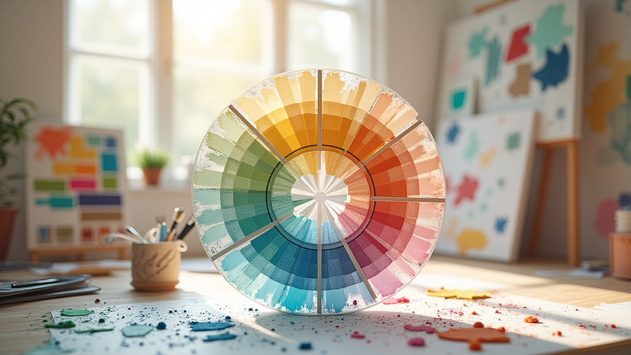
Diving Deep into 2024 Color Palette Trends
Let’s explore the color palette trends that are making waves in 2024. We will look at specific colors, why they are popular, and how they make us feel. We will also see examples of these colors in action.
Earthy Neutrals with Pops of Color
This 2024 color trend is all about feeling calm and connected to nature. It uses colors like warm beige, muted green, and terracotta. These are like the colors of the earth – sand, leaves, and clay. To make it more interesting, designers add small bits of bright colors like mustard yellow.
- Description: This palette combines the grounding nature of earthy tones with the vibrancy of accent colors. Think warm beige (#F5F5DC), muted green (#8FBC8F), and terracotta (#E2725B), punctuated by pops of mustard yellow (#FFDA63).
- Why It’s Popular: People like this palette because it feels peaceful and reminds them of nature. It’s also easy to use in many different designs.
- Visual Examples: Imagine a website for a nature retreat with a beige background, green leaves in the logo, and yellow buttons. Or a poster for a pottery class with terracotta clay and a beige border.
- Color Psychology: Beige makes us feel stable and safe. Green makes us think of growth and health. Terracotta feels warm and inviting. Yellow brings a feeling of happiness and optimism. According to a study by Emerald, color plays a key role in branding and marketing effectiveness.
- Accessibility Considerations: Make sure there is enough difference between the colors so people can read text easily. For example, yellow text on a beige background might be hard to read.
Bold and Saturated Jewel Tones
This 2024 color trend is all about being fancy and getting attention. It uses colors like sapphire blue, emerald green, ruby red, and amethyst purple. These colors are like the colors of precious jewels.
- Description: These colors are rich and intense. Sapphire blue (#0F52BA), emerald green (#50C878), ruby red (#E0115F), and amethyst purple (#9966CC) create a sense of luxury and drama.
- Why It’s Popular: These colors are used to make things look expensive and special. They grab your attention and make you want to look closer.
- Visual Examples: Think of a website for a jewelry store with a dark blue background and sparkling emerald green gems. Or a poster for a fancy party with ruby red decorations and amethyst purple lights.
- Color Psychology: Blue makes us feel trusting and calm. Green makes us think of wealth and nature. Red makes us feel passionate and excited. Purple makes us feel wise and creative.
- Accessibility Considerations: Be careful when using these colors together. Some combinations might be hard for people with color blindness to see. Use a contrast checker to ensure text is readable.
Muted Pastels with a Modern Twist
This 2024 color trend takes soft, gentle colors and makes them feel new and fresh. It uses colors like blush pink, mint green, powder blue, and a shade of purple called wisteria (#C9A0DC).
- Description: These colors are soft and light. Blush pink (#F0B2B6), mint green (#98FF98), powder blue (#A0D6B4), and wisteria create a calming and elegant feel.
- Why It’s Popular: These colors are used to make things look pretty and modern. They are often used in websites and apps that want to feel friendly and welcoming.
- Visual Examples: Imagine an app for meditation with a light blue background and mint green icons. Or a website for a flower shop with blush pink roses and wisteria accents.
- Color Psychology: Pink makes us feel gentle and loving. Green makes us think of peace and nature. Blue makes us feel calm and safe. Wisteria evokes feelings of nostalgia and wonder.
- Accessibility Considerations: Pastel colors can be tricky because they are light. Make sure the text is dark enough to read easily against the pastel background.
Beyond 2024: Forecasting Color Trends for 2025
Now that we know what’s popular in 2024, let’s try to predict the 2025 color trends. By looking at what’s happening now, we can guess what colors will be popular in the future.
Right now, people are drawn to colors that feel comforting and familiar, but also to colors that are bold and exciting. Technology is getting better, which means we can use more colors in new and interesting ways. What does this mean for the future?
Experts think that warmer tones might become more popular again. Instead of the very cool colors we’ve seen lately, we might see more oranges, yellows, and reds. However, it’s more likely that earthy colors will remain dominant. The world is in a state of turmoil and uncertainty right now, and earthy colors are linked to comfort and stability, and can have very soothing qualities.
Keep an eye out for new colors and changes in what people like. The world of color is always changing, so it’s important to stay curious and open to new ideas.
The Psychology Behind the Palettes: Understanding Color Associations
Understanding color psychology is key to effective design and branding. Colors aren’t just pretty – they make us feel things. By using the right colors, brands can influence how people feel about their products and services.
- Blue: Blue is often associated with trust, security, and calmness. That’s why many banks and hospitals use blue in their logos and websites.
- Red: Red is a color of passion, excitement, and energy. It can grab attention and make people feel energized. That’s why it’s often used in sales and marketing materials.
- Green: Green makes us think of nature, health, and growth. It’s often used by companies that want to seem eco-friendly or natural.
- Yellow: Yellow is a happy and optimistic color. It can make people feel cheerful and energetic. It’s often used by companies that want to seem fun and playful.
For example, McDonald’s uses red and yellow to make people feel hungry and excited. Banks often use blue to make people feel safe and secure. Understanding these color associations can help you choose the right colors for your brand and design projects. Studies by Emerald have shown the importance of color in creating emotional associations that impact consumers.
Color Accessibility: Ensuring Inclusivity in Design
Color accessibility means making sure that everyone can see and understand the colors you use in your designs. This is important for people with visual impairments, color blindness, or other disabilities. It’s not just the right thing to do, it also makes your designs better for everyone.
Here are some tips for creating accessible color palettes:
- Use Sufficient Contrast: Make sure there’s enough difference between the text color and the background color. This makes it easier for people to read the text. WebAIM’s Contrast Checker can help you find accessible color combinations.
- Avoid Problematic Color Combinations: Some color combinations, like blue and yellow, can be difficult for people with color blindness to see. Avoid using these combinations in important parts of your design.
- Consider Color Blindness: About 8% of men and 0.5% of women have some form of color blindness. Use tools that simulate color blindness to see how your designs look to people with this condition.
By following these tips, you can create designs that are accessible to everyone, regardless of their visual abilities.
The AI Revolution: How Artificial Intelligence is Shaping Color Palette Creation
Artificial intelligence (AI) is changing the way we create color palettes. AI tools can generate beautiful and harmonious color combinations quickly and easily. These tools use algorithms to understand how colors work together and create palettes that are visually appealing.
Here are some benefits of using AI color palettes:
- Speed: AI can generate color palettes in seconds, saving you time and effort.
- Efficiency: AI can analyze millions of color combinations to find the best ones for your project.
- Novelty: AI can generate unique and unexpected color palettes that you might not have thought of on your own.
While AI cannot replace the creativity and intuition of human designers, it can be a valuable tool for inspiration and exploration.
Industry Spotlights: Color Trends in Action
Let’s see how color trends are being used in different industries:
Tech
Tech companies often use blue and white in their user interfaces (UIs). This is because blue makes people feel trusting and secure, while white makes things look clean and modern. Some companies are starting to use more playful colors to seem friendlier and more approachable.
Fashion (Dopamine Dressing & Maximalism)
In the fashion world, there’s a trend called “dopamine dressing.” This means wearing clothes in bright, happy colors to boost your mood. This trend has led to a rise in bold and saturated color palettes. Maximalism is another important factor, which is also a growing trend that emphasizes vibrant, bold, and rich colors.
Food
Food brands are increasingly using natural, muted color palettes. This is because people want food that seems healthy and sustainable. Colors like green, brown, and beige are often used to evoke feelings of nature and freshness.
Digital vs. Print: Are There Different Color Rules?
Yes, there are definitely different color rules for digital and print design! This is because of the way colors are created and displayed in each medium.
- Technical Considerations: Digital designs use RGB (red, green, blue) colors, while print designs use CMYK (cyan, magenta, yellow, black) colors. These are different color spaces, which means that colors can look different on a screen than they do on paper. It’s important to convert your colors to CMYK before printing to avoid unexpected results.
- Color Preferences: Some color palettes are better suited for digital designs, while others are better for print materials. For example, bright, saturated colors can look great on a screen but may be too intense for print. Muted, earthy tones often work well in print.
Consider website design color choices and make sure the colors translate correctly when printed for marketing materials.
Case Studies: Successful Brand Color Updates
Let’s look at some brands that have successfully updated their color palettes:
Mailchimp Branding Refresh
Mailchimp, the email marketing company, recently updated its branding with a more vibrant and playful color palette. The old palette was mostly blue and gray, which felt professional but also a bit boring. The new palette includes bright colors like yellow, pink, and green, which make the brand seem more fun and approachable. This change helped Mailchimp attract a wider audience and stand out from the competition.
Duolingo’s Vibrant Visuals
Duolingo, the language learning app, uses a bright and engaging color palette centered around its iconic green owl. This color scheme not only reinforces brand recognition but also injects a sense of fun and approachability into the learning experience. The consistent use of vibrant colors across the app and marketing materials contributes to Duolingo’s playful and memorable brand image.
Tools and Resources for Color Palette Creation
Here are some useful tools and resources for creating color palettes:
- Adobe Color: A website and app for creating, exploring, and saving color palettes. Adobe Color also provides information on color theory and accessibility.
- Coolors.co: Another popular online tool for generating and exploring color palettes, offering features like palette saving, exporting, and contrast checking.
- WebAIM’s Contrast Checker: An essential resource for ensuring color accessibility by checking the contrast ratio between foreground and background colors.
- Pantone Color Institute: An authority on color trends and color psychology. Their website provides insights into color trends and cultural influences on color preferences.
Conclusion
In this post, we explored the color palette trends that are popular in 2024 and looked ahead to 2025. We learned about color psychology, color accessibility, and how AI is changing the way we create color palettes. Remember, staying updated on color trends and understanding how colors make people feel is key to creating effective and engaging designs.
Now it’s your turn! Experiment with these color palettes and tools in your own design projects. See what you can create and how colors can help you achieve your goals.
For Further Reading
To deepen your understanding of design principles, explore these resources:
- Learn about the fundamental aspects of visual harmony in Color Theory for Graphic Designers
- Explore the strategies that can elevate your brand’s identity in Branding Strategies for 2024.
- Discover the best fonts that complement your brand’s message in How to Choose the Right Typography for Your Brand.
“`